Burning Down the House
The delayed housing cycle likely holds the key to an impending recession. Good news and bad news.

A quick side note: One of the fantastic conceits of the internet era is that everyone’s opinions are valuable. And unfortunately, the only way to ascertain that is by determining if people are willing to pay for them. I’m now devoting enough time to my Substack activities that I need to decide “Is this valuable, or am I simply shouting into the void?” As a result, I will be shifting to a paid subscription on June 1st. The objective is not to maximize revenue, and if there is any reason you feel you cannot afford a subscription but would like to continue receiving this Substack in full, please email yesigiveafig@regmanagement.net. Suggestions on subscription pricing are also very much appreciated. Now back to your regularly scheduled drivel.
“Are we there yet?” It’s the time of the season when pundits and market speculators come together to furiously debate if we are, or perhaps ever will be, in a recession. It’s always remarkable how angry people can get on both sides of this “angels on a pin” debate about unknowable future events. Some patterns repeat, but it’s never the same this time.
One of the charts I’ve shared recently looks at the nature of revisions to official data releases (more below). Data on revisions is available (with a lag) from the Philadelphia Fed in their “Real-time Data Set,” which is an excellent resource for budding quantitative economists as a reminder that the data we see confidently presented on screens for our analysis in prior cycles has been heavily revised. For example, the GDP releases we wait for with bated breath have a historical revision level that reminds us that we know nothing in real-time. Imagine being poor Arthur Burns and trying to “manage” an economy with GDP reports nearly 10% off the actual data. This is one of the key reasons I am so skeptical of claims that Fed policy is “appropriate.” There’s too much variability in the data for us to know within 25bps… or even 200bps… what the “right” interest rate is.

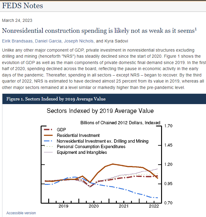
However, helpful information CAN emerge from revision patterns, as the moving average in the above chart suggests. For example, throughout the 1960s and 1970s, revisions, on average, were higher, reflecting more significant growth pressures than realized at the time. Likewise, the post-GFC data was consistently revised lower, reflecting slower growth than initially believed. Interestingly, this pattern ended in 2014 — well before Trump, tax cuts, or the massive fiscal stimulus of 2020. We don’t yet know what the revisions will bring for the post-2020 environment, but an intriguing paper highlighted for me by Joey Politano offers a clue. In the simplest terms, the methodology used for calculating “real” investment in commercial construction (and almost certainly, by extension, multifamily residential, which is leading overall residential to offer a similar pattern) is leading to understated historical GDP:
The gist of the paper is pretty simple. The methodology used for calculating real Construction GDP is as follows with appropriate highlights:
The Bureau of Economic Analysis (BEA) estimates real output for each subsector by dividing nominal output by sector-specific deflators, mainly producer price indexes (PPIs) developed by the Bureau of Labor Statistics (BLS). The measurement of nominal output is based on a construction spending survey conducted by the U.S. Census Bureau (Census). The estimate of nominal output is based on both responses from responding firms as well as imputations for non-responding firms.
For non-responding projects, monthly imputed spending is based on time-to-build patterns for responding projects, subject to a cap on imputed spending.8 Over time, imputation rates tend to fall as more projects eventually respond and the estimates of nominal spending are revised to reflect these late responses.
The Census considers a non-responding project as completed once imputed construction costs reach 101.5 percent of their original estimated cost. This imputation cap might lead to underestimates of spending if many imputed projects are experiencing cost overruns larger than in recent history.
In plain English, the Census Bureau assumes a project is complete once it has hit 101.5% of original costs and it ceases contributing to GDP estimates. This can have an egregious effect when the denominator for conversion from nominal to real has risen 33% in 3 years AND project delays have become de riguer. While I don’t have the data for non-residential, the data for multi-family residential suggests delays have become endemic. Hat tip to Warren Pies of 3Fourteen Research for inspiration:

This is an intriguing realization because it suggests that real GDP is currently higher than historically reported. This helps explain the elevated inflation, tight labor market AND suggests we have MORE risk of a forward-looking slowdown as the interest rate-sensitive construction sector is revised HIGHER historically and LOWER in the near future as price indices retreat and labor markets inevitably ease. It would also help explain the very puzzling collapse in output per worker in the construction sector — the collapse was “fake news” driven by methodology:

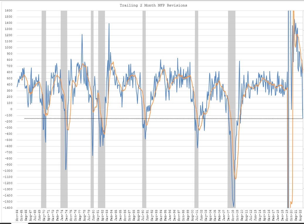
This interpretation is supported again by the revisions to historical data from the Philadelphia Fed… this time for jobs. My critiques of the Birth/Death model for payrolls is well known, but suffice it to say that we know it does a terrible job at economic turning points due to its use of a trailing trend (ARIMA) approach. This maximizes estimates of jobs created by net firm births at precisely the point the economy is entering a recession. Post-pandemic, estimates of the proportion of jobs coming from new businesses being created are the highest in history. Fodder for future downward revisions:

And intriguingly, these revisions appear to be coming our way. Using a straightforward model that references the trailing two-month revisions to payrolls suggests we are already at a level of downward revisions that are consistent with a recession now.
Other metrics, ranging from leading economic indicators to WARN notices (layoff announcements from large firms), Challenger job cuts, etc, suggest the same. The notable exception that we are all forced to acknowledge is the tight labor market. Again, I would argue this is a function of inappropriate aggregation. The labor force has changed remarkably in a very short period of time, with the number of workers with college degrees rising by 15MM while the rest of the labor force fell. The proportion of the labor force with a college degree has nearly doubled in the last 30 years. And predictably, unemployment rates for this now well-supplied cohort have begun to rise even as it retreats for those without college degrees.

As we discussed in The Remains of the Day, the segmented Beveridge Curve continues to suggest we are at a tipping point in white-collar workers with college degrees. Job openings for both white and blue collar (“skilled and unskilled” with no judgment to be clear) have fallen, but we remain far off levels that will loosen the blue-collar workforce while the white-collar is rapidly approaching the tipping point:

Again, this matches with data from the construction market, where the delays and high level of absolute construction suggest an undersupplied labor market. This is quite different from 2008, when employment was running above modeled levels and “chased down,” and it helps to explain why we have not (yet) experienced the declines in construction employment that rGDP reports suggest should have occurred. But the rapidly falling permits and starts suggest this is about to change:

In other words, while we cannot know the future during these turbulent times, we can begin to understand some of the confusion about the present. Both bulls and bears have it right. For the bulls, it’s better “right now” than the official data would suggest (rGDP is higher as is nominal GDP due to errors in construction estimation methodology, debt/GDP is moderately better, and labor productivity/unit labor costs are quite a bit better than official estimates in the services sector). On the downside for the bears, forward results are likely to be revised down as inflationary forces reverse with slowing permits, starts, and tightening financial conditions.
The slowdown is likely more severe than we might estimate simply from the decline in permits as there is a pattern, again almost exclusively in multi-family and nonresidential, to abandon projects after permitting due to deteriorating economic conditions.
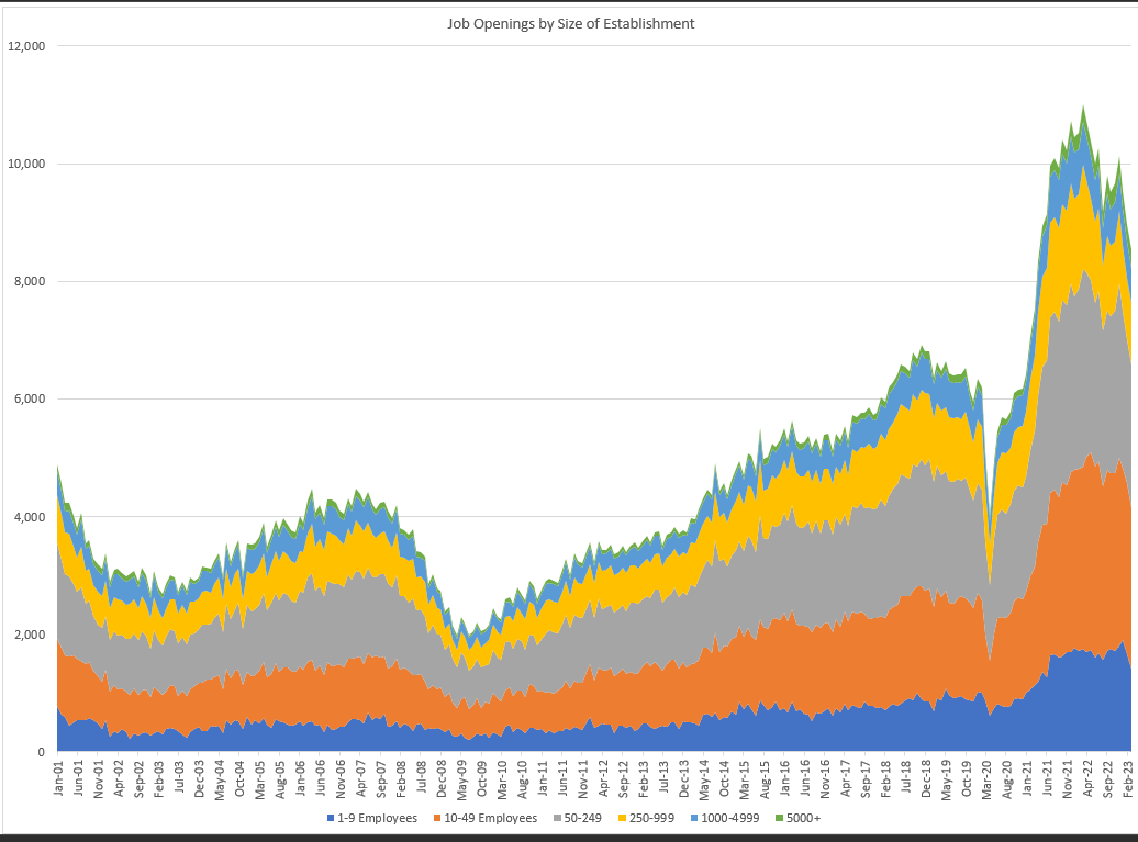
We’re also seeing a rapid decline in job openings, especially among smaller firms:
And as openings fall, hires typically follow. This last job report was notable for the high level of hiring from small firms who, as we previously discussed (again in Remains of the Day), typically hire from less than college grads:

With declining hires and declining job openings, the net number of NEW job openings is falling rapidly across establishment size, again suggesting that a recession is imminent:

As I’ve repeatedly emphasized, we can’t KNOW the true answer until history (and revisions) decide to reveal themselves, but based on the available data, a reconciliation of the mysterious plunge in construction output per worker and the pattern of revisions, the weight of the evidence suggests recession is here.
As always, comments are appreciated.
It's interesting how getting faster access to data generated alpha. Today we seem to have most of the data we want at our fingertips, and alpha is now to be found in understanding nuances to the data gathering process, and where flaws in said processes create narratives that diverge from reality.
$10 month, max. Doomberg charges $30 and for that reason I don't subcribe to his stack.