Part 1: My Life Is a Lie
How a Broken Benchmark Quietly Broke America

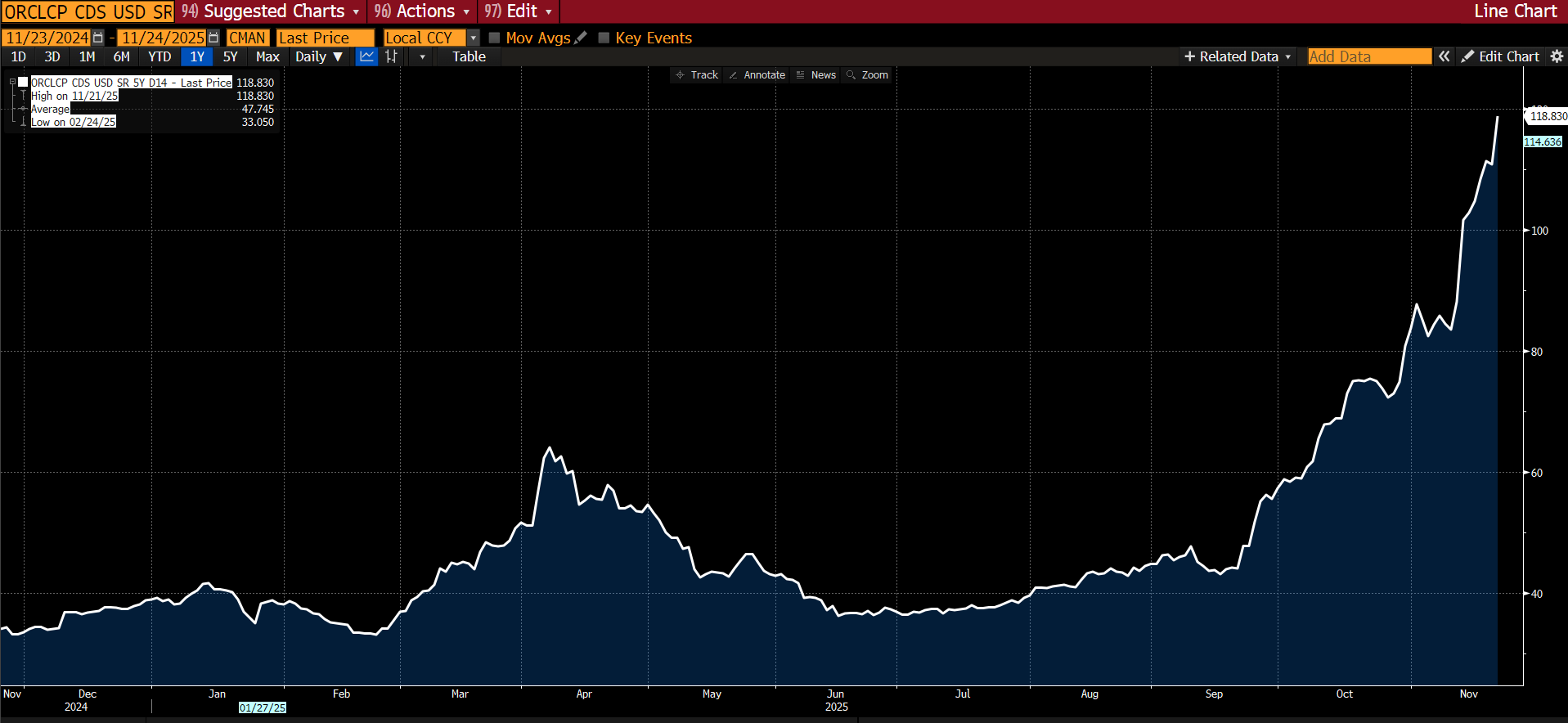
We’re going to largely skip markets again, because the sweater is rapidly unraveling in other areas as I pull on threads. Suffice it to say that the market is LARGELY unfolding as I had expected — credit stress is rising, particularly in the tech sector. Many are now pointing to the rising CDS for Oracle as the deterioration in “AI” balance sheets accelerates. CDS was also JUST introduced for META — it traded at 56, slightly worse than the aggregate IG CDS at 54.5 (itself up from 46 since I began discussing this topic):
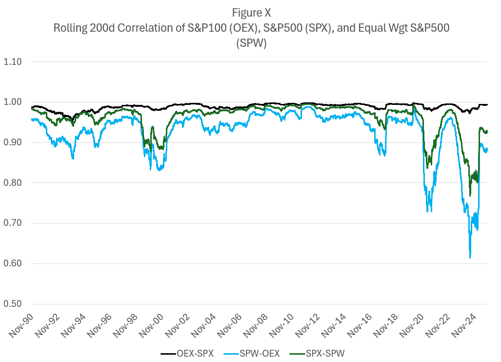
Correlations are spiking as MOST stocks move in the same direction each day even as megacap tech continues to define the market aggregates:
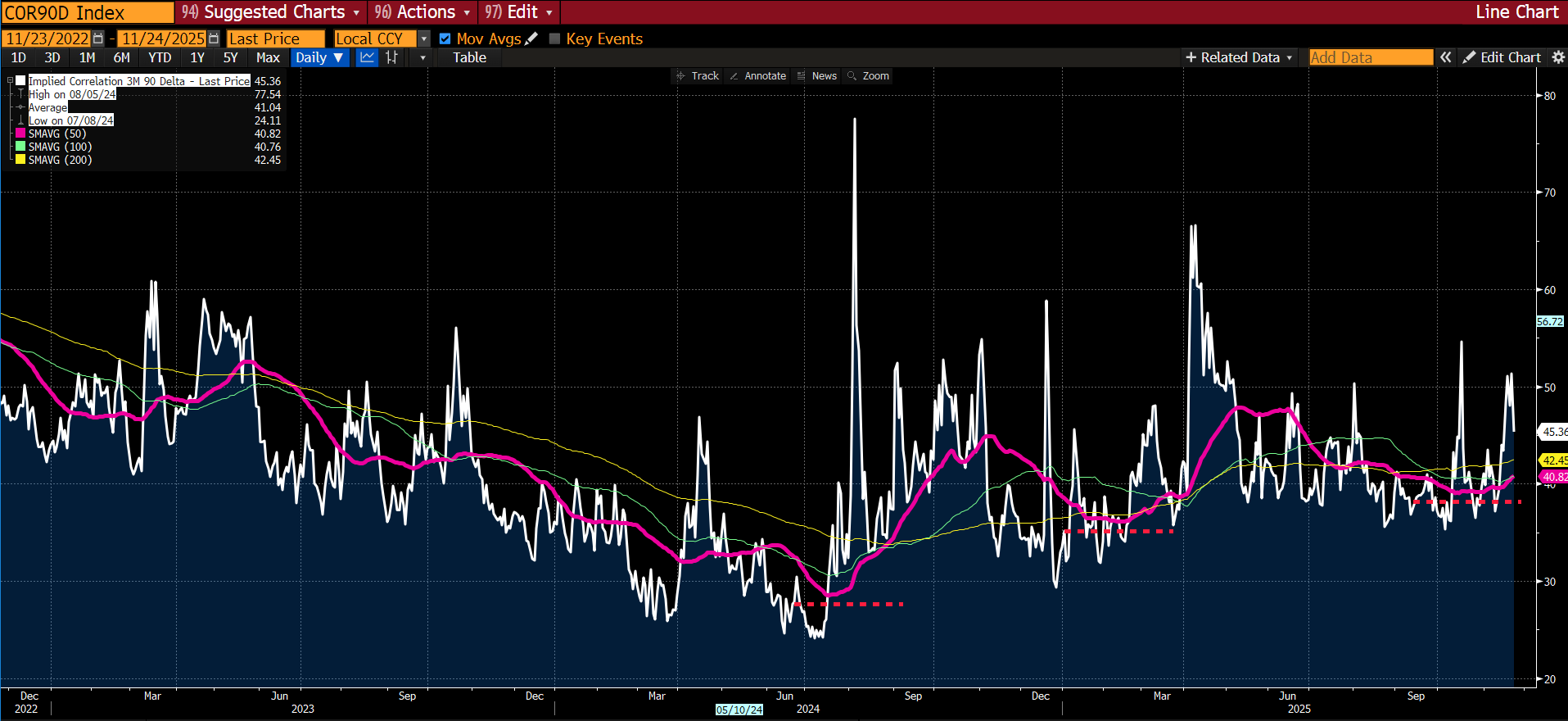
Market pricing of correlation is beginning to pick up… remember this is the “real” fear index and the moving averages are trending upwards:
And, as I predicted, inflation concerns, notably absent from any market-based indication, are again freezing the Fed. The pilots are frozen, understanding that they are in Zugzwang — every choice has unfavorable options.

And so now, let’s tug on that loose thread… I’m sure many of my left-leaning readers will say, “This is obvious, we have been talking about it for YEARS!” Yes, many of you have; but you were using language of emotion (“Pay a living wage!”) rather than showing the math. My bad for not paying closer attention; your bad for not showing your work or coming up with workable solutions. Let’s rectify it rather than cast blame.
How a Broken Benchmark Quietly Broke America
I have spent my career distrusting the obvious.
Markets, liquidity, factor models—none of these ever felt self-evident to me. Markets are mechanisms of price clearing. Mechanisms have parameters. Parameters distort outcomes. This is the lens through which I learned to see everything: find the parameter, find the distortion, find the opportunity.
But there was one number I had somehow never interrogated. One number that I simply accepted, the way a child accepts gravity.
The poverty line.
I don’t know why. It seemed apolitical, an actuarial fact calculated by serious people in government offices. A line someone else drew decades ago that we use to define who is “poor,” who is “middle class,” and who deserves help. It was infrastructure—invisible, unquestioned, foundational.
This week, while trying to understand why the American middle class feels poorer each year despite healthy GDP growth and low unemployment, I came across a sentence buried in a research paper:
“The U.S. poverty line is calculated as three times the cost of a minimum food diet in 1963, adjusted for inflation.”
I read it again. Three times the minimum food budget.
I felt sick.
The Measurement Failure
The formula was developed by Mollie Orshansky, an economist at the Social Security Administration. In 1963, she observed that families spent roughly one-third of their income on groceries. Since pricing data was hard to come by for many items, e.g. housing, if you could calculate a minimum adequate food budget at the grocery store, you could multiply by three and establish a poverty line.
Orshansky was careful about what she was measuring. In her January 1965 article, she presented the poverty thresholds as a measure of income inadequacy, not income adequacy—”if it is not possible to state unequivocally ‘how much is enough,’ it should be possible to assert with confidence how much, on average, is too little.”
She was drawing a floor. A line below which families were clearly in crisis.
For 1963, that floor made sense. Housing was relatively cheap. A family could rent a decent apartment or buy a home on a single income, as we’ve discussed. Healthcare was provided by employers and cost relatively little (Blue Cross coverage averaged $10/month). Childcare didn’t really exist as a market—mothers stayed home, family helped, or neighbors (who likely had someone home) watched each other’s kids. Cars were affordable, if prone to breakdowns. With few luxury frills, the neighborhood kids in vo-tech could fix most problems when they did. College tuition could be covered with a summer job. Retirement meant a pension income, not a pile of 401(k) assets you had to fund yourself.
Orshansky’s food-times-three formula was crude, but as a crisis threshold—a measure of “too little”—it roughly corresponded to reality. A family spending one-third of its income on food would spend the other two-thirds on everything else, and those proportions more or less worked. Below that line, you were in genuine crisis. Above it, you had a fighting chance.
But everything changed between 1963 and 2024.
Housing costs exploded. Healthcare became the largest household expense for many families. Employer coverage shrank while deductibles grew. Childcare became a market, and that market became ruinously expensive. College went from affordable to crippling. Transportation costs rose as cities sprawled and public transit withered under government neglect.
The labor model shifted. A second income became mandatory to maintain the standard of living that one income formerly provided. But a second income meant childcare became mandatory, which meant two cars became mandatory. Or maybe you’d simply be “asking for a lot generationally speaking” because living near your parents helps to defray those childcare costs.
The composition of household spending transformed completely. In 2024, food-at-home is no longer 33% of household spending. For most families, it’s 5 to 7 percent.
Housing now consumes 35 to 45 percent. Healthcare takes 15 to 25 percent. Childcare, for families with young children, can eat 20 to 40 percent.
If you keep Orshansky’s logic—if you maintain her principle that poverty could be defined by the inverse of food’s budget share—but update the food share to reflect today’s reality, the multiplier is no longer three.
It becomes sixteen.
Which means if you measured income inadequacy today the way Orshansky measured it in 1963, the threshold for a family of four wouldn’t be $31,200.
It would be somewhere between $130,000 and $150,000.
And remember: Orshansky was only trying to define “too little.” She was identifying crisis, not sufficiency. If the crisis threshold—the floor below which families cannot function—is honestly updated to current spending patterns, it lands at $140,000.
What does that tell you about the $31,200 line we still use?
It tells you we are measuring starvation.
“An imbalance between rich and poor is the oldest and most fatal ailment of all republics.” — Plutarch
The Real Math of Survival
The official poverty line for a family of four in 2024 is $31,200. The median household income is roughly $80,000. We have been told, implicitly, that a family earning $80,000 is doing fine—safely above poverty, solidly middle class, perhaps comfortable.
But if Orshansky’s crisis threshold were calculated today using her own methodology, that $80,000 family would be living in deep poverty.
I wanted to see what would happen if I ignored the official stats and simply calculated the cost of existing. I built a Basic Needs budget for a family of four (two earners, two kids). No vacations, no Netflix, no luxury. Just the “Participation Tickets” required to hold a job and raise kids in 2024.
Using conservative, national-average data:
Childcare: $32,773
Housing: $23,267
Food: $14,717
Transportation: $14,828
Healthcare: $10,567
Other essentials: $21,857
Required net income: $118,009
Add federal, state, and FICA taxes of roughly $18,500, and you arrive at a required gross income of $136,500.
This is Orshansky’s “too little” threshold, updated honestly. This is the floor.
The single largest line item isn’t housing. It’s childcare: $32,773.
This is the trap. To reach the median household income of $80,000, most families require two earners. But the moment you add the second earner to chase that income, you trigger the childcare expense.
If one parent stays home, the income drops to $40,000 or $50,000—well below what’s needed to survive. If both parents work to hit $100,000, they hand over $32,000 to a daycare center.
The second earner isn’t working for a vacation or a boat. The second earner is working to pay the stranger watching their children so they can go to work and clear $1-2K extra a month. It’s a closed loop.
The Housing Lie (Or, Why the Model Is Optimistic)
Critics will immediately argue that I’m cherry-picking expensive cities. They will say $136,500 is a number for San Francisco or Manhattan, not “Real America.”
So let’s look at “Real America.”
The model above allocates $23,267 per year for housing. That breaks down to $1,938 per month. This is the number that serious economists use to tell you that you’re doing fine.
In my last piece, Are You An American?, I analyzed a modest “starter home” which turned out to be in Caldwell, New Jersey—the kind of place a Teamster could afford in 1955. I went to Zillow to see what it costs to live in that same town if you don’t have a down payment and are forced to rent.
There are exactly seven 2-bedroom+ units available in the entire town. The cheapest one rents for $2,715 per month.
That’s a $777 monthly gap between the model and reality. That’s $9,300 a year in post-tax money. To cover that gap, you need to earn an additional $12,000 to $13,000 in gross salary.
So when I say the real poverty line is $140,000, I’m being conservative. I’m using optimistic, national-average housing assumptions. If we plug in the actual cost of living in the zip codes where the jobs are—where rent is $2,700, not $1,900—the threshold pushes past $160,000.
The market isn’t just expensive; it’s broken. Seven units available in a town of thousands? That isn’t a market. That’s a shortage masquerading as an auction.
And that $2,715 rent check buys you zero equity. In the 1950s, the monthly housing cost was a forced savings account that built generational wealth. Today, it’s a subscription fee for a roof. You are paying a premium to stand still.
The Hedonic “Lie”: Why a Phone Costs $200, Not $58
Economists will look at my $140,000 figure and scream about “hedonic adjustments.” Heck, I will scream at you about them. They are valid attempts to measure the improvement in quality that we honestly value.
I will tell you that comparing 1955 to 2024 is unfair because cars today have airbags, homes have air conditioning, and phones are supercomputers. I will argue that because the quality of the good improved, the real price dropped.
And I would be making a category error. We are not calculating the price of luxury. We are calculating the price of participation.
To function in 1955 society—to have a job, call a doctor, and be a citizen—you needed a telephone line. That “Participation Ticket” cost $5 a month.
Adjusted for standard inflation, that $5 should be $58 today.
But you cannot run a household in 2024 on a $58 landline. To function today—to factor authenticate your bank account, to answer work emails, to check your child’s school portal (which is now digital-only)—you need a smartphone plan and home broadband.
The cost of that “Participation Ticket” for a family of four is not $58. It’s $200 a month.
The economists say, “But look at the computing power you get!”
I say, “Look at the computing power I need!”
The utility I’m buying is “connection to the economy.” The price of that utility didn’t just keep pace with inflation; it tripled relative to it.
I ran this “Participation Audit” across the entire 1955 budget. I didn’t ask “is the car better?” I asked “what does it cost to get to work?”
Healthcare: In 1955, Blue Cross family coverage was roughly $10/month ($115 in today’s dollars). Today, the average family premium is over $1,600/month. That’s 14x inflation.
Taxes (FICA): In 1955, the Social Security tax was 2.0% on the first $4,200 of income. The maximum annual contribution was $84. Adjusted for inflation, that’s about $960 a year. Today, a family earning the median $80,000 pays over $6,100. That’s 6x inflation.
Childcare: In 1955, this cost was zero because the economy supported a single-earner model. Today, it’s $32,000. That’s an infinite increase in the cost of participation.
The only thing that actually tracked official CPI was… food. Everything else—the inescapable fees required to hold a job, stay healthy, and raise children—inflated at multiples of the official rate when considered on a participation basis. YES, these goods and services are BETTER. I would not trade my 65” 4K TV mounted flat on the wall for a 25” CRT dominating my living room; but I don’t have a choice, either.
The Valley of Death: Why $100,000 Is the New Poor
Once I established that $136,500 is the real break-even point, I ran the numbers on what happens to a family climbing the ladder toward that number.
What I found explains the “vibes” of the economy better than any CPI print.
Our entire safety net is designed to catch people at the very bottom, but it sets a trap for anyone trying to climb out. As income rises from $40,000 to $100,000, benefits disappear faster than wages increase.
I call this The Valley of Death.
Let’s look at the transition for a family in New Jersey:
1. The View from $35,000 (The “Official” Poor)
At this income, the family is struggling, but the state provides a floor. They qualify for Medicaid (free healthcare). They receive SNAP (food stamps). They receive heavy childcare subsidies. Their deficits are real, but capped.
2. The Cliff at $45,000 (The Healthcare Trap)
The family earns a $10,000 raise. Good news? No. At this level, the parents lose Medicaid eligibility. Suddenly, they must pay premiums and deductibles.
Income Gain: +$10,000
Expense Increase: +$10,567
Net Result: They are poorer than before. The effective tax on this mobility is over 100%.
3. The Cliff at $65,000 (The Childcare Trap)
This is the breaker. The family works harder. They get promoted to $65,000. They are now solidly “Working Class.”
But at roughly this level, childcare subsidies vanish. They must now pay the full market rate for daycare.
Income Gain: +$20,000 (from $45k)
Expense Increase: +$28,000 (jumping from co-pays to full tuition)
Net Result: Total collapse.
When you run the net-income numbers, a family earning $100,000 is effectively in a worse monthly financial position than a family earning $40,000.
At $40,000, you are drowning, but the state gives you a life vest. At $100,000, you are drowning, but the state says you are a “high earner” and ties an anchor to your ankle called “Market Price.”
In option terms, the government has sold a call option to the poor, but they’ve rigged the gamma. As you move “closer to the money” (self-sufficiency), the delta collapses. For every dollar of effort you put in, the system confiscates 70 to 100 cents.
No rational trader would take that trade. Yet we wonder why labor force participation lags. It’s not a mystery. It’s math.
The Physics of Ruin: The Phase Change
The most dangerous lie of modern economics is “Mean Reversion.” Economists assume that if a family falls into debt or bankruptcy, they can simply save their way back to the average.
They are confusing Volatility with Ruin.
Falling below the line isn’t like cooling water; it’s like freezing it. It is a Phase Change.
When a family hits the barrier—eviction, bankruptcy, or default—they don’t just have “less money.” They become Economically Inert.
They are barred from the credit system (often for 7–10 years).
They are barred from the prime rental market (landlord screens).
They are barred from employment in sensitive sectors.
In physics, it takes massive “Latent Heat” to turn ice back into water. In economics, the energy required to reverse a bankruptcy is exponentially higher than the energy required to pay a bill.
The $140,000 line matters because it is the buffer against this Phase Change. If you are earning $80,000 with $79,000 in fixed costs, you are not stable. You are super-cooled water. One shock—a transmission failure, a broken arm—and you freeze instantly.
The Lockdown Arbitrage: Proof of Concept
If you need proof that the cost of participating, the cost of working, is the primary driver of this fragility, look at the Covid lockdowns.
In April 2020, the US personal savings rate hit a historic 33%. Economists attributed this to stimulus checks. But the math tells a different story.
During lockdown, the “Valley of Death” was temporarily filled.
Childcare ($32k): Suspended. Kids were home.
Commuting ($15k): Suspended.
Work Lunches/Clothes ($5k): Suspended.
For a median family, the “Cost of Participation” in the economy is roughly $50,000 a year. When the economy stopped, that tax was repealed. Families earning $80,000 suddenly felt rich—not because they earned more, but because the leak in the bucket was plugged. For many, income actually rose thanks to the $600/week unemployment boost. But even for those whose income stayed flat, they felt rich because many costs were avoided.
When the world reopened, the costs returned, but now inflated by 20%. The rage we feel today is the hangover from that brief moment where the American Option was momentarily back in the money. Those with formal training in economics have dismissed these concerns, by and large. “Inflation” is the rate of change in the price level; these poor, deluded souls were outraged at the price LEVEL. Tut, tut… can’t have deflation now, can we? We promise you will like THAT even less.
But the price level does mean something, too. If you are below the ACTUAL poverty line, you are suffering constant deprivation; and a higher price level means you get even less in aggregate.
The Politics of Drowning
You load sixteen tons, what do you get?
Another day older and deeper in debt
Saint Peter, don’t you call me, ‘cause I can’t go
I owe my soul to the company store — Merle Travis, 1946
This mathematical valley explains the rage we see in the American electorate, specifically the animosity the “working poor” (the middle class) feel toward the “actual poor” and immigrants.
Economists and politicians look at this anger and call it racism, or lack of empathy. They are missing the mechanism.
Altruism is a function of surplus. It is easy to be charitable when you have excess capacity. It is impossible to be charitable when you are fighting for the last bruised banana.
The family earning $65,000—the family that just lost their subsidies and is paying $32,000 for daycare and $12,000 for healthcare deductibles—is hyper-aware of the family earning $30,000 and getting subsidized food, rent, childcare, and healthcare.
They see the neighbor at the grocery store using an EBT card while they put items back on the shelf. They see the immigrant family receiving emergency housing support while they face eviction.
They are not seeing “poverty.” They are seeing people getting for free the exact things that they are working 60 hours a week to barely afford. And even worse, even if THEY don’t see these things first hand… they are being shown them:

The anger isn’t about the goods. It’s about the breach of contract. The American Deal was that Effort ~ Security. Effort brought your Hope strike closer. But because the real poverty line is $140,000, effort no longer yields security or progress; it brings risk, exhaustion, and debt.
When you are drowning, and you see the lifeguard throw a life vest to the person treading water next to you—a person who isn’t swimming as hard as you are—you don’t feel happiness for them. You feel a homicidal rage at the lifeguard.
We have created a system where the only way to survive is to be destitute enough to qualify for aid, or rich enough to ignore the cost. Everyone in the middle is being cannibalized. The rich know this… and they are increasingly opting out of the shared spaces:
The Optical Illusion of Prosperity
If you need visual proof of this benchmark error, look at the charts that economists love to share on social media to prove that “vibes” are wrong and the economy is great.
You’ve likely seen this chart. It shows that the American middle class is shrinking not because people are getting poorer, but because they’re “moving up” into the $150,000+ bracket.
The economists look at this and cheer. “Look!” they say. “In 1967, only 5% of families made over $150,000 (adjusted for inflation). Now, 34% do! We are a nation of rising aristocrats.”

But look at that chart through the lens of the real poverty line.
If the cost of basic self-sufficiency for a family of four—housing, childcare, healthcare, transportation—is $140,000, then that top light-blue tier isn’t “Upper Class.”
It’s the Survival Line.
This chart doesn’t show that 34% of Americans are rich. It shows that only 34% of Americans have managed to escape deprivation. It shows that the “Middle Class” (the dark blue section between $50,000 and $150,000)—roughly 45% of the country—is actually the Working Poor. These are the families earning enough to lose their benefits but not enough to pay for childcare and rent. They are the ones trapped in the Valley of Death.
But the commentary tells us something different:
“Americans earned more for several reasons. The first is that neoliberal economic policies worked as intended. In the last 50 years, there have been big increases in productivity, solid GDP growth and, since the 1980s, low and predictable inflation. All this helped make most Americans richer.”
“neoliberal economic policies worked as intended” — read that again. With POSIWID (the purpose of a system is what it does) in mind.
The chart isn’t measuring prosperity. It’s measuring inflation in the non-discretionary basket. It tells us that to live a 1967 middle-class life in 2024, you need a “wealthy” income.
And then there’s this chart, the shield used by every defender of the status quo:
Poverty has collapsed to 11%. The policies worked as intended!
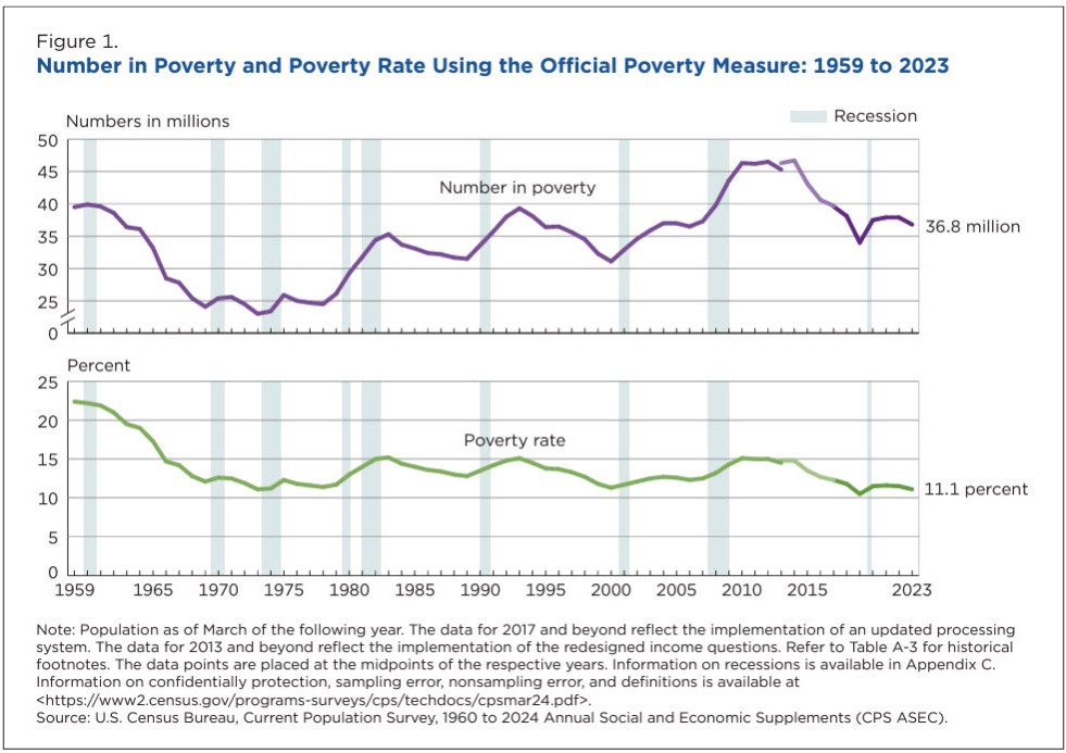
But remember Mollie Orshansky. This chart is measuring the percentage of Americans who cannot afford a minimum food diet multiplied by three.
It’s not measuring who can afford rent (which is up 4x relative to wages). It’s not measuring who can afford childcare (which is up infinite percent). It’s measuring starvation.
Of course the line is going down. We are an agricultural superpower who opened our markets to even cheaper foreign food. Shrimp from Vietnam, tilapia from… don’t ask. Food is cheap. But life is expensive.
When you see these charts, don’t let them gaslight you. They are using broken rulers to measure a broken house. The top chart proves that you need $150,000 to make it. The bottom chart proves they refuse to admit it.
The Lie
So that’s the trap. The real poverty line—the threshold where a family can afford housing, healthcare, childcare, and transportation without relying on means-tested benefits—isn’t $31,200.
It’s ~$140,000.
Most of my readers will have cleared this threshold. My parents never really did, but I was born lucky — brains, beauty (in the eye of the beholder admittedly), height (it really does help), parents that encouraged and sacrificed for education (even as the stress of those sacrifices eventually drove my mother clinically insane), and an American citizenship. But most of my readers are now seeing this trap for their children.
And the system is designed to prevent them from escaping. Every dollar you earn climbing from $40,000 to $100,000 triggers benefit losses that exceed your income gains. You are literally poorer for working harder.
The economists will tell you this is fine because you’re building wealth. Your 401(k) is growing. Your home equity is rising. You’re richer than you feel.
Next week, I’ll show you why that’s wrong. And THEN we can start the discussion of how to rebuild. Because we can.
The wealth you’re counting on—the retirement accounts, the home equity, the “nest egg” that’s supposed to make this all worthwhile—is just as fake as the poverty line. But the humans behind that wealth are real. And they are amazing.
