Greedflation -- Yes, it exists
As does policy stupidity. Just be thankful you're not European (and condolences if I'm wrong about that)

If you bought a car, filled your gas tank, or just existed in the economy between 2021 and 2022, you felt it: prices didn’t just rise; they skyrocketed. And whether you understood what “transitory inflation” meant, or whether you were (like most people rightly) concerned with the price level, it has been a source of perpetual angst ever since.
For the last two years, a fierce debate has raged over why. Now that the dust is settling, the macroeconomic establishment is busy writing the official post-mortem. But a close look at the recent literature reveals that academia and the Federal Reserve are relying on contaminated statistics and accounting illusions to explain away what actually happened. And, of course, they are doing it to benefit the elite and corporate interests that increasingly dominate the discussion.
Let’s look at two of the most prominent recent attempts to explain the disaster—one pinning the blame on fiscal deficits, the other absolving corporate pricing power—and why the math underneath both of them completely falls apart when you look at the actual receipts.
Part I: The Fiscal Mirage and the Endogeneity Trap
A popular narrative among macroeconomists is the “fiscal mechanism”—the idea that unexpected government deficits were the primary driver of the unexpected surge in global inflation. A recent high-profile paper by Ricardo Reis attempts to prove this by plotting the unexpected deficit shocks of OECD countries against their unexpected inflation shocks, drawing a neat red trendline through the scatter plot.
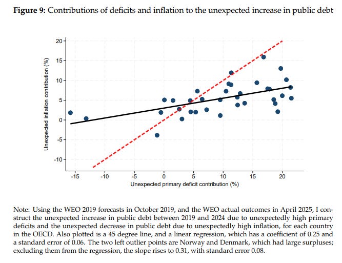
It looks like a definitive macroeconomic law: countries that ran bigger deficits suffered worse inflation. My partner, Harley Bassman, would be thrilled (always a sign of errors in analysis). But to get that trendline, Reis errs in two massive, highly revealing ways.
Error 1: The Outlier Illusion vs. Statistical Rigor
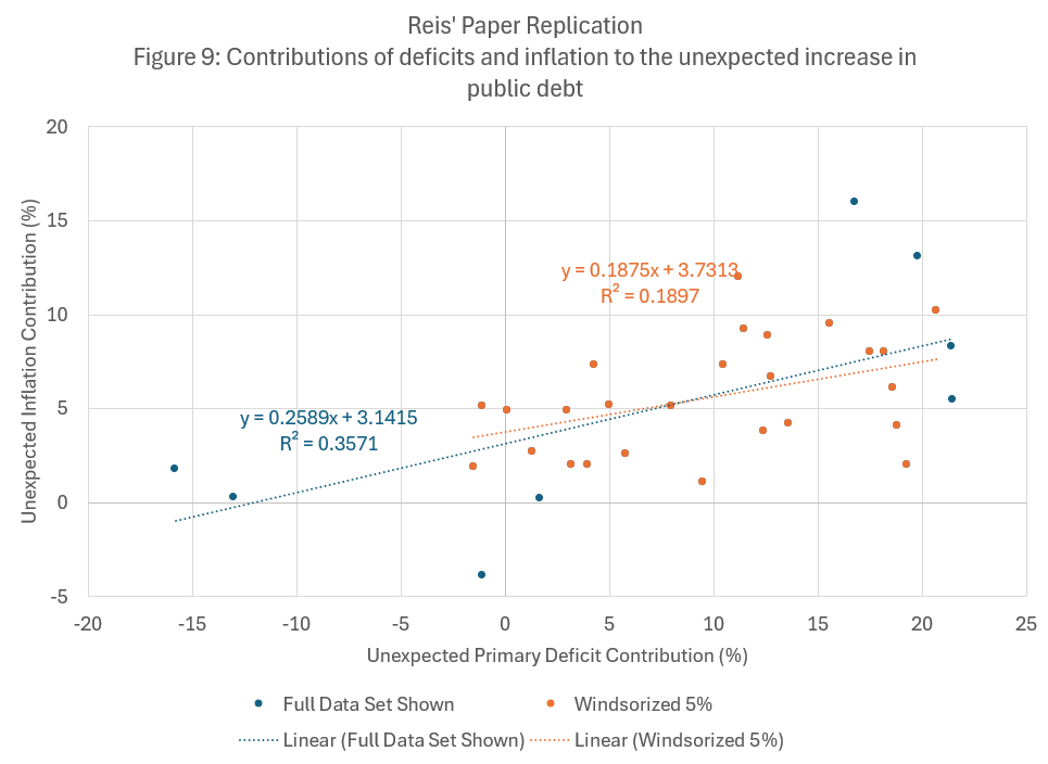
In the paper, Reis explicitly notes that if you selectively discard two glaring outliers on the far left of the chart (Norway and Denmark), his regression line steepens and his R-sq improves. But subjectively cherry-picking which countries to exclude to make a theory look better is terrible statistics.
If you instead apply standard statistical rigor to the dataset—such as a 5% Windsorization, which objectively trims the extreme tails on both sides of the distribution rather than subjectively dropping two data points—the narrative collapses. The R-sq doesn’t improve; it drops by nearly 50%, falling to a meager 0.189. The trend is a fragile mirage entirely dependent on extreme outliers.
Error 2: Unnecessarily Complicating the Y-Axis
Worse, Reis unnecessarily complicates the inflation story. If you want to explain the consumer cost-of-living crisis, you should plot Consumer Price Inflation (CPI). But Reis didn’t do that. Because he is aiming to prove the Fiscal Theory of the Price Level (FTPL), his Y-axis uses a convoluted “debt impact” analysis, measuring how much the national debt was erased by unexpected inflation (the denominator effect).
It’s a niche academic debt metric, not a measure of household purchasing power. And it fundamentally distorts the data, hiding the mechanical effects of inflation on government balance sheets behind an accounting identity.
The Receipts: What Happens When We Clean the Data?
We can strip out these illusions. If we go to the IMF’s World Economic Outlook and Fiscal Monitor databases, we can rebuild this chart using the metrics that actually matter:
A Clean X-Axis: The Cyclically Adjusted Primary Balance, which explicitly strips out cyclical noise, inflation-tax windfalls, and interest payments to isolate the actual discretionary legislative choices made by politicians.
A Clean Y-Axis: The actual 5-year unexpected surge in pure consumer inflation, throwing out the convoluted “debt impact” math.
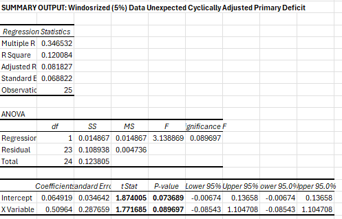
When you plot the clean structural data against actual consumer prices, the vaunted “fiscal mechanism” begins to breakdown even further. First, the full sample R-sq falls to only 0.08, weak sauce at best. Second, Windsorization now IMPROVES the outcomes, suggesting that there very well may be a mechanism with a similar coefficient (0.25) to the fabricated Reis’ result:
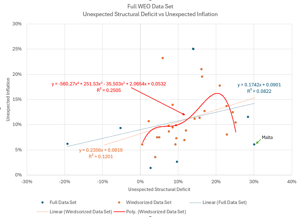
But the coefficient is far from statistically significant. You can always draw a regression line through a scatter plot—but if it collapses into statistical insignificance, you must look elsewhere.
Another method of testing this is to extend the regression into polynomial form. I’ve included a four-factor polynomial just for kicks, as it’s oddly shaped like my career trajectory and I always like to remind myself that this is the downslope, but the point remains — any higher order (2 factor, 3 factor, 4 factor, etc) regression suggests that there’s a “magic middle” fiscal deficit that drives unexpected inflation. Or maybe not. Because when we look at the countries, a different grouping falls out naturally:
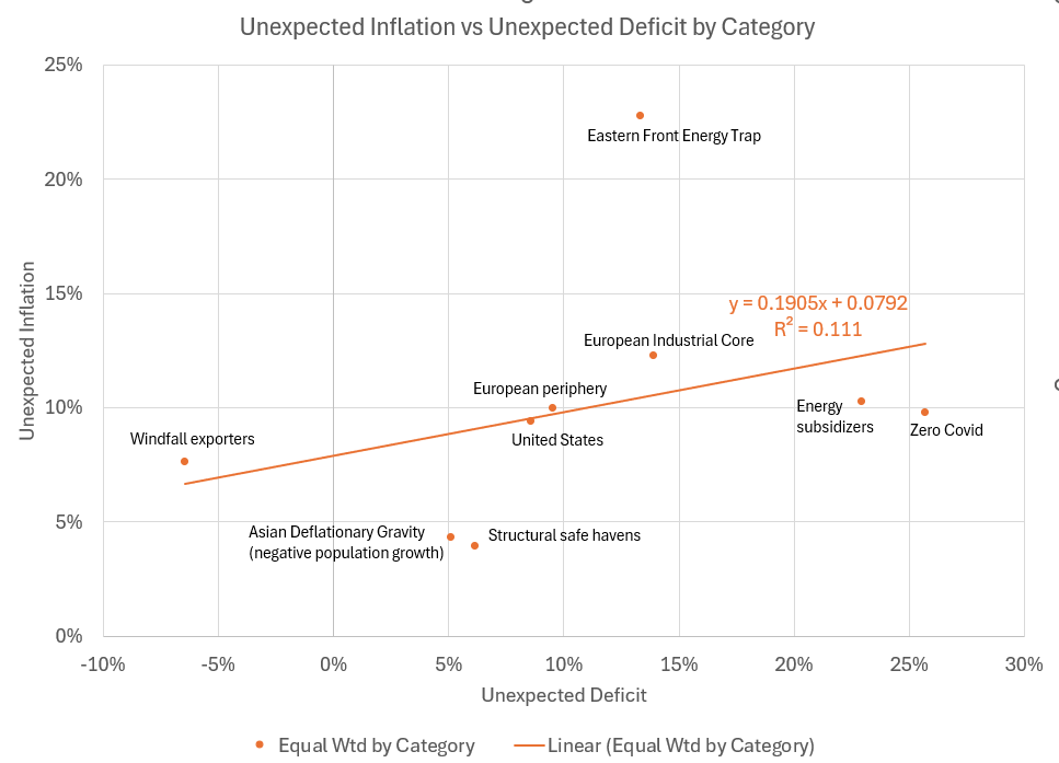
This approach groups countries by WHY they experienced inflation. Estonia, Latvia, Lithuania, etc are all sitting on the front lines of the Russia embargo. Countries like the UK chose to subsidize domestic energy, keeping a lid on prices, but exploding deficits. Zero covid countries did zero covid things. And of course windfall exporters, e.g. Norway, experienced inflation largely as a result of economies booming due to oil exports. Asia? Safe havens? They remained structurally deflationary in a sea of elevated inflation. Can we rethink this chart even further and offend 90% of the world’s population in the process? Well, yes, this is YIGAF, and that’s our specialty:
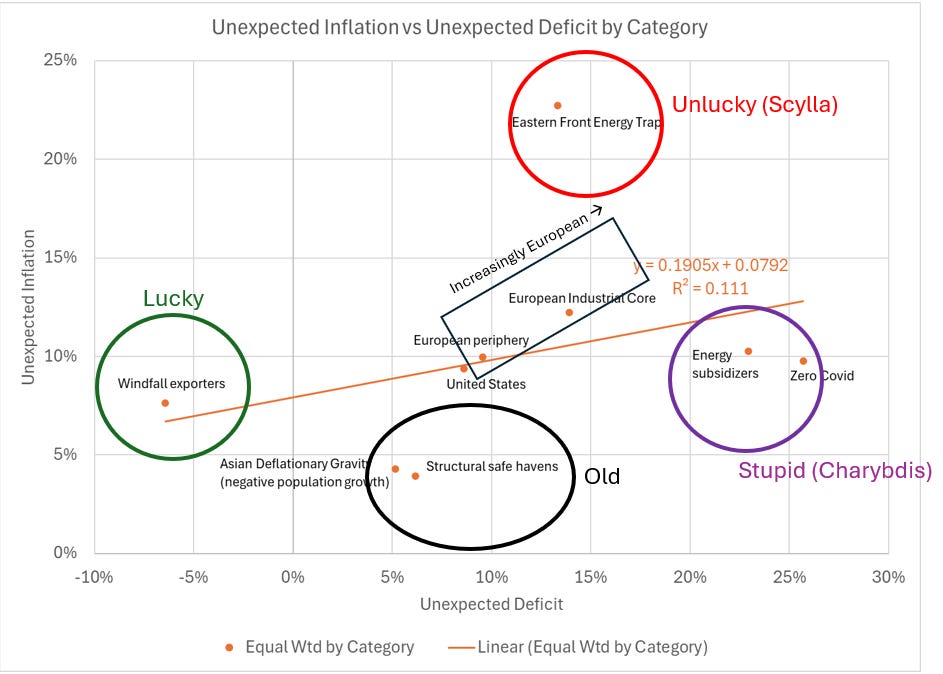
The only trend I can actually identify that has any statistical validity is in the “increasingly European” path navigating between Scylla (unlucky) and Charybdis (stupidity). I’m sure my European readers are familiar with this trajectory. Relatively deflationary conditions persist in the “old.” And the United States? Really, the only country that aggressively engaged in fiscal stimulus? It’s sitting right in the center of the universe where Donald Trump thinks it belongs.
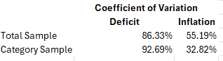
We can find statistical support for these groupings using the “coefficient of variation” — basically a test of “do groupings make sense?” If the coefficient of variance declines when data are grouped, it statistically suggests that the datapoints indeed share a common descriptive. If it increases versus the total sample, there is little evidence that the groupings are valid. This is exactly what we see — inflation CV falls when grouped. The same grouping results in an expansion of the deficit CV. This is yet another demonstration that Reis’s approach is completely wrong, and that deficits are not “the” driver of increased inflation. But then again, he’s in the UK, so fully in the grasp of the Charybdis whirlpool.
When you throw out the politics-contaminated math, the truth emerges. Inflation was a byproduct of who you relied on (Russia) and how stupid your politicians were. Both of these are solvable for almost any nation. Just not through deficit targeting.
Part II: The Fed’s “Flat Markup” Illusion
This kind of methodological blind spot isn’t isolated to academia’s fiscal theories. It’s exactly the same type of statistical gaslighting that the Federal Reserve Bank of San Francisco (FRBSF) used to confidently dismiss the “Greedflation” narrative.
During the inflation surge, critics argued that highly concentrated firms used the fog of global volatility to aggressively hike prices and pad their profit margins. In their May 2024 Economic Letter, the FRBSF attempted to put this debate to rest. They concluded that “aggregate markups... have stayed essentially flat” and that the post-pandemic path of markups “is not unusual compared with previous recoveries”. Therefore, they argue, corporate pricing power was not a main driver of the inflation surge.
To prove this, they plot the cumulative change in aggregate markups during the last four recoveries (1991, 2001, 2008, and 2020). To make the lines comparable, they index the start of the 2020 recovery to the exact moment the NBER declared the recession over (Q2 2020).
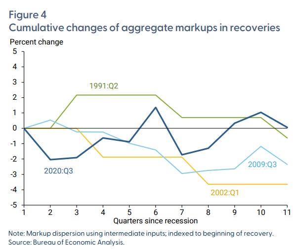
But treating the summer of 2020 like a normal business cycle trough is absurd. The economy wasn’t “recovering” in the traditional sense; it had been legally halted by government mandate and was waiting to be thawed by trillions in fiscal stimulus.
When you adjust for this and look at what happens when the economy actually reopens and the stimulus fully hits the system (starting in Q4 2020), the Fed’s “normal” narrative completely implodes.
